Ballet has been described as an art form created by the movement of the human body. It is a type of dance performed on a stage in front of an audience. The word ballet is derived from the French word ballette, which in turn was taken from the Italian word balletto, the diminutive of the word ballo, which means a dance.
Today this word conjures, in most people’s minds, the image of graceful female dancers leaping through the air in their tutus. The centuries-long history of ballet, however, is not pervaded by the modern stereotypical image of this art form. In fact, the ballets of the past, especially from this dance’s earlier period, looked quite different from the performances of today.
The Origins of Ballet
Ballet is commonly said to have originated in Renaissance Italy. Whilst some suggest that it began sometime between the end of the 15th century and the beginning of the 16th century, others date this type of dance to the 17th century.
For those who subscribe to the former suggestion, ballet is said to have begun as a type of entertainment to fill the time between the various courses at a banquet. For example, 1489 saw the marriage of the Duke of Milan, Galeazzo Visconti, to Isabella of Aragon in Tortona. To celebrate this joyous occasion, a choreographer by the name of Bergonzio di Botta prepared a series of dances (known as ‘entrées’) to complement the different courses that were being served at the wedding banquet. These dances were closely related to the menu, and drew inspiration (to some extent) from Classical mythology. For instance, the roast lamb was preceded by the story of Jason and the Golden Fleece.
 Representation of a Ballet before Henri III and his Court, in the Gallery of the Louvre. Re-engraving from an original on Copper in the ‘Ballet comique de la Royne by Balthazar de Beaujoyeulx’ (Paris: Ballard, 1582). (Public Domain)
Di Botta’s dances were well-received, and soon became fashionable, especially amongst the upper classes of Italian society. By performing such dances, members of this social class believed that they were showing off their talent, wealth, and, above all, cultural sophistication, one of the values most associated with the Italian Renaissance.
From Italy, ballet would spread to France during the first half of the 16th century. This was made possible thanks to the marriage of the Italian noblewoman, Catherine de’ Medici to the future King of France, Henry II. As she was a great patron of the arts, ballet was introduced to, and funded by, the French court.
 Modern grace, - or - the operatical finale to the ballet of Alonzo e Caro, by James Gillray. (Public domain)
Elaborate Costumes
At this point of time, ballet consisted of a number of theatrical elements. Similar to the ballets which are performed today, these spectacles involved music and dances. Apart from these familiar elements, ballet at this early stage also involved poetry and pantomime.
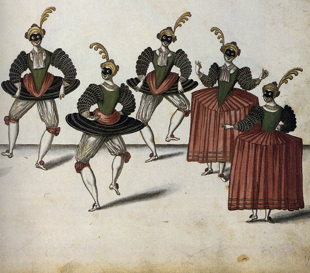
Additionally, the outfits used by ballet dancers during this period are quite different from that used today. For instance, dancers wore “masks, layers upon layers of brocaded costuming, pantaloons, large headdresses and ornaments”. Such an outfit may be said to be an ostensive display of its wearer’s wealth.
Nevertheless, this mass of clothing was rather cumbersome, and inhibited a dancer’s movement. Thus, dance steps consisted of relatively simple movements, including “small hops, slides, curtsies, promenades and gentle turns”.
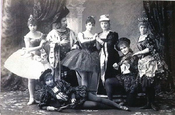
 A publicity photo for the premiere of Tchaikovsky's ballet ‘The Sleeping Beauty’ (1890). (Public Domain)
The social context of ballet may also be said to have been quite different at this early period. Although the di Botta’s dances were meant to entertain, by the time it arrived in France, it became somewhat more serious.
A King’s Role
Like the Italians of the Renaissance, ballet was performance by the upper classes of French society. Unlike the audience-orientated performances of today, such dances were meant to entertain the dancers. As court life could be monotonous and boring at times, ballet was seen as a form of amusement. Additionally, being able to dance was “necessary social accomplishment” for the people at court. Thus, kings, princes, aristocrats and courtiers learnt the ballet. Interestingly, it may be noted that during this time, ballet was a male dance, and female dancers only became prominent after the French Revolution.
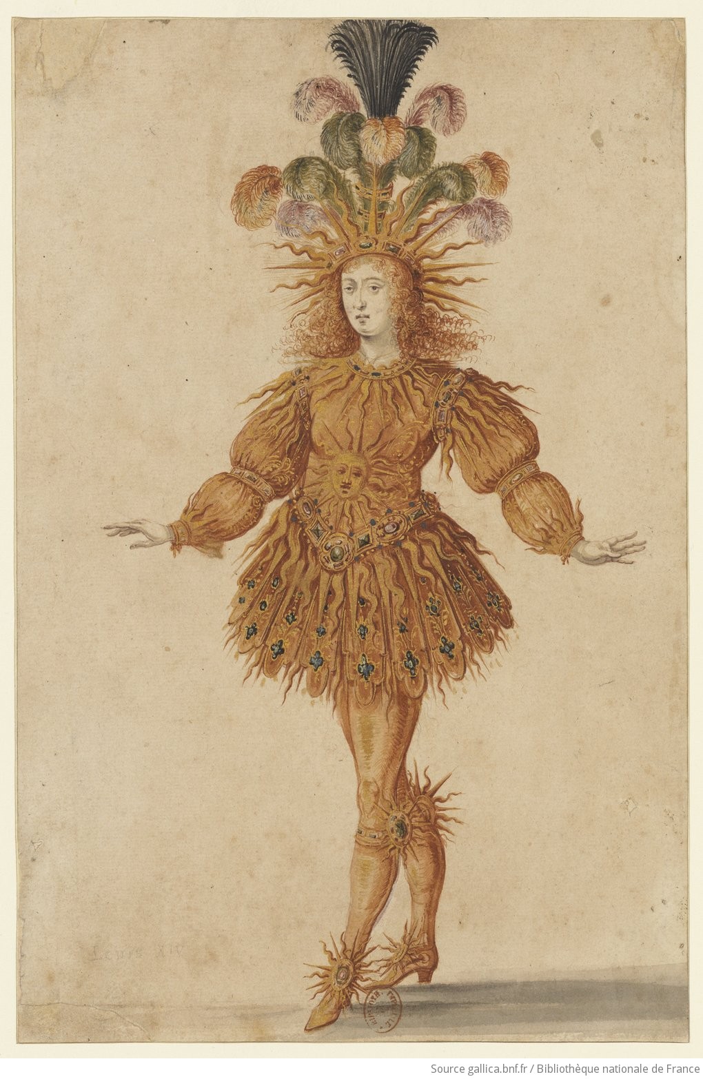
One of the most famous figures who danced the ballet was Louis XIV of France. This king was a passionate ballet dancer, and is also known as ‘The Sun King’, since he played the role of the Sun (personified by the Greek god Apollo) in the Ballet de la Nuit in 1653.
 Louis XIV in Lully's Ballet de la nuit (1653). (CC BY-SA 3.0)
One of the greatest contributions of this king to ballet was the establishment of the Academie Royale de Danse in 1661. It was in this academy that the first professional ballet dancers were trained. As a consequence, ballet would no longer be enjoyed only by the court, but would, through theaters, gradually be disseminated to all levels of society.
Another important achievement of the academy was the codification of the five positions of the feet and arms by one of its ballet masters, Pierre Beauchamp (who was also Louis XIV’s personal ballet tutor). These positions continue to be taught and used even today. From France, ballet would eventually spread to the rest of the world, and continue its evolution as an art form.
Featured image: The Royal Ballet of the Dowager of Bilbao's Grand Ball, 1626. Photo source: Public Domain.
References
- Atlanta Ballet, 2016. A Brief History of Ballet. [Online] Available at: http://www.atlantaballet.com/resources/brief-history-of-ballet
- Davies, D. & Homans, J., 2011. Tracing Ballet's Cultural History Over 400 Years. [Online] Available at: http://www.npr.org/2011/12/16/143775428/tracing-ballets-cultural-history-over-400-years
- Harper, D., 2016. Ballet. [Online] Available at: http://www.etymonline.com/index.php?term=ballet
- Pittsburgh Ballet Theatre, 2016. What is Ballet?. [Online] Available at: http://www.pbt.org/community-engagement/what-ballet
- The Australian Ballet, 2015. History of ballet. [Online] Available at: https://www.australianballet.com.au/education/about_ballet/history_of_ballet
- Victoria and Albert Museum, 2016. The Origins of Ballet. [Online] Available at: http://www.vam.ac.uk/content/articles/o/origins-of-ballet/
- www.ccs.neu.edu, 2016. History of Ballet. [Online] Available at: http://www.ccs.neu.edu/home/yiannis/dance/history.html

Drawing Types, History of Graphic Arts Introduction & Characteristics
Definition
In fine art, the term "drawing" may be defined as the linear realization of visual objects, concepts, emotions, and fantasies, including symbols and even abstract forms. Drawing is a graphic art which is characterized by an emphasis on form or shape, rather than mass and color as in painting. Drawing is quite different from graphic printmaking processes, because although a drawing may form the basis for replication, it is by its very nature, unique.
The Basis of Other Art forms
Most drawing is dependent on other types of art. Thus, although not every painting, mosaic, tapestry or other artwork has been preceded by a drawing in the form of a preliminary sketch, drawing is in reality the basis of all visual arts. For example, an architectural drawing is the basis for all building construction; markings drawn on a raw stone block are the basis for the sculpture that emerges; initially most paintings grow out of preliminary sketches - only as the works proceed are they consolidated into colored surfaces. Besides, a growing number of investigations, demonstrate that drawings form the material basis of mural, panel, and book paintings, statues, etchings, engravings, mosaics, stained glass, and many other forms of decorative art. Such preparatory sketches may be limited to broad guidelines or they may regulate the whole work down to the smallest details.
Drawing is Also an Independent Art form
In addition, as an independent stand-alone art form, drawing offers the widest possible scope for creative expression. Bodies, space, depth, three-dimensionality, and even movement can be made visible through drawing. Furthermore, drawing expresses the draughtsman's personality spontaneously in the flow of the line, making it one of the most personal of all artistic statements.
Drawing Media
Drawings can be produced using a wide variety of drawing instruments, including pen and ink, charcoal, chalks, pastels, metalpoint, silverpoint, graphite point, colored crayons, as well as graver, burin or etching needle for incised types of drawing. Other alternatives are wax or conte crayons, markers, graphite sticks, and various types of inked pens. The most usual support (the material upon which the image is drawn) is obviously paper, but other options include card, board, papyrus, cardboard, canvas, leather, vellum (calfskin), textiles - even plastic or metal. Mixed-media drawings are those executed using a combination of these materials.
Drawing Versus Painting

The line between drawing and painting has always been slightly blurred. For example, Chinese art, performed with a brush on silk or paper, is as near to drawing as to fine art painting (eg. Calligraphy). Some illuminated manuscripts from the Middle Ages, such as the Utrecht Psalter, have pen-and-ink drawings of such freedom of line that they resemble modern cartoons, and effectively serve the same function as paintings. Even so, drawing as an independent art form did not emerge until the Renaissance art of the quattrocento (15th century). Until then, drawing (disegno) was seen as inferior to painting (colorito). See also: Art Evaluation: How to Appreciate Art.
Drawing Experts
The word draughtsman (or draftsman) is the usual term for an artist who practices drawing. Examples of supreme draftsmanship, especially figurative drawing, include works by Old Masters like Leonardo Da Vinci, Michelangelo, Albrecht Durer, Peter Paul Rubens, Rembrandt, Jacques Louis David, and other famous painters such as: Honore Daumier, Edgar Degas, Egon Schiele, Max Beckmann, David Hockney, and Lucian Freud, to name but a few.
Categories of Drawing
In general terms drawing encompasses 3 basic categories: Casual drawing, (doodling, sketching): this denotes unfinished and usually unrefined compositions. These drawings have no ongoing function. Preparatory drawing: this denotes the creation of a specific image or series of images, forming the whole or part of a composition which the artist intends to complete by adding pigment color (paints, colored inks etc). Finished drawing: this denotes a completed stand-alone autonomous work, such as an illustration, a cartoon, a caricature, or graphic design.
Subject Matter
Draughtsmen have incorporated all types of images in their compositions, including representations of humans and animals in all genres, such as narrative history images, portraits, caricatures, and genre scenes, as well as landscapes or still life compositions. Some draughtsmen specialize in precise reproductions of existing or proposed buildings (architectural drawing), ships (marine drawing), flowers (botanical illustration) or horses (equestrian drawing), or animals as well as abstract compositions from Cubist to typographical or calligraphic compositions.
Drawing Methods
An enormous number of tools and implements can be used to draw, including slate pencils, metal styli, charcoal, and chalks, as well as traditional pens, pencils, and brushes, fountain pens, ball-point pens, and felt pencils; indeed, even chisels and diamonds are used for drawing. See also Automatism in Art for its automatic drawing.
Charcoal
 Partially consumed pieces of wood have been used ever since the era of Prehistoric art, when paleolithic artists produced the amazing cave painting to be found at Chauvet, Lascaux and Altamira. The tradition was maintained by the Old Masters, whose preparatory charcoal drawings for mural, panel, and even miniature painting can still occasionally be seen under the pigment. Drawing charcoal typically gives a porous and not very adhesive stroke. A pointed charcoal pencil can produce exceptionally thin lines; if used broadside on the surface, it creates evenly toned planes. Rubbing and smudging the charcoal line results in dimmed intermediate shades and delicate transitions. Due to its slight adhesiveness, charcoal is ideal for corrective sketching, but if the drawing is to be preserved, it needs to be protected by a fixative.
As a medium for rapid sketches from life models, charcoal was much in use in art academies and workshops. Difficult poses, such as Tintoretto demanded of his models, could be captured quickly and easily with the adaptable charcoal pencil. (For more on Tintoretto's drawings, see: Venetian Drawing 1500-1600.) Charcoal was also widely used in preparatory sketches for portraiture. In his charcoal drawing Portrait of a Lady, the French painter Edouard Manet (1832-83) managed to capture the grain of the wood in the chair, the fur trimming on the dress, the compactness of the coiffure, and the softness of the flesh. The 17th-century Dutch painter Paulus Potter (1625-54) was another great exponent, as also were the great draftsmen of modern age, such as Toulouse-Lautrec (1864-1901), Edgar Degas (1834-1917), Kathe Kollwitz (1867-1945), and Ernst Barlach (1870-1938).
With oiled charcoal, that is, charcoal pencils dipped in linseed oil, artists obtained better adhesion and a deeper black. Utilized in the 16th century by Tintoretto, this technique was particularly popular with Dutch Realist artists of the 17th century, in order to set deep-black accents. However, in return for better adhesion in the indentations of the paper, correction becomes more difficult. Moreover, charcoal crayons that have been deeply immersed in oil leave a brownish streak alongside the lines.
Chalks
 Chalks are an equally important drawing medium. Where charcoal is primarily a medium for quick correctable sketching, chalk drawing can achieve this and more. Since the beginning of the 16th century, stone chalk, as found in nature, has become increasingly more popular in art drawing. As a natural material, alumina chalk has various degrees of hardness, so that the stroke varies from slightly granular to homogeneously dense and smooth. The search for uniform quality has led to the production of special chalks for drawing; that is, chalks, which, after being pulverized, washed, and formed into convenient sticks, allow a softer, more regular stroke and are also free of sandy particles. The addition of pigments creates various tints from a rich black to a brownish grey; compared to the much-used black chalk, the brown variety is of little significance. White chalk, also found in nature, is hardly ever used as an independent medium for drawing, although it is often used in combination with other mediums in order to achieve as individual accents of reflected light.
Starting from the 15th century, chalk has been employed increasingly for studies and sketches. Its suitability for drawing precise lines of a given width and for creating finely shaded tints makes it especially appropriate for modelling studies. Because of these attributes, chalk is a particularly good medium for autonomous drawings, and there is hardly a draftsman who has not worked in chalk, often in combination with other media. Apart from portrait drawings, landscapes have formed the main theme of chalk drawings, especially with the Dutch. Ever since the invention of artificial chalk made from the fine, dull-black soot known as lampblack - an invention attributed to Leonardo da Vinci (1452-1519) - the pictorial qualities of chalk have been fully explored. The range of chalks extends from dry, charcoal-like varieties to the fatty ones used by lithographers.
Sanguine, a chalk-and-iron-oxide drawing pencil, was a popular drawing medium in the 15th century, because of its wealth of colourful possibilities. It was popular with Michelangelo, Raphael and Andrea del Sarto (1486-1531), while Leonardo da Vinci used it in his sketches for The Last Supper: see also Michelangelo's Profile with Oriental Headdress (1522, Ashmolean Museum, Oxford). Other artists who used sanguine included the portraitists Jean Clouet and Hans Holbein, the Flemish School around Peter Paul Rubens, and, above all, 18th-century French artists such as Watteau, Nicolas Lancret, Jean-Etienne Liotard, Jacques-Andre Ponail, and Francois Boucher. The Scottish 18th century portraitist Allan Ramsay was an avid user of preparatory chalk drawings for his portraits. Sanguine offered even greater colour differentiation when used in combination with black and white chalks, on coloured paper.
Chalk drawings are also associated with modern draftsmen such as Edgar Degas, Odilon Redon, Gustave Moreau, Jean-Edouard Vuillard, and Pierre Bonnard, as well as Expressionist artists like Edvard Munch and Ernst Ludwig Kirchner.
Pastels
 Even greater colour refinement is possible with pastel crayons, made from powdered pigments mixed with a minimum amount of non-greasy binder. When the colors are applied to paper, they invariably look fresh and bright, although they must be preserved from dispersion by being kept under glass. Pastel colors can be applied in linear technique directly with the crayons, or to an area of the paper directly with the fingers. Pastels originated in the north of Italy during the 16th century, and were employed by Jacopo Bassano (1515-92) and Federico Barocci (1526-1612). Pastel drawings were known to the Accademia degli Incamminati no later than the 17th century, although as an art form it did not reach its apogee until the 18th century, notably in France (with Jean Marc Nattier, Maurice Quentin de La Tour, Jean-Baptiste Perronneau and Jean Chardin) and in Venice (with Rosalba Carriera). Pastel chalks were especially favoured by portraitists.
Metalpoints
 The technique of metal point has been used in writing and delineation ever since antiquity, so it needed little imagination to employ it also in drawing. Artists use a slim tool (rod or stylus) of pure soft metal, such as lead, silver, tin, copper as well as various lead-and-pewter alloys. The most commonly used material was soft lead, which when used on a smooth surface produces a pale grey line; it is not very strong in color, and easily erasable, and is therefore ideal for preparatory sketches.
Paper preparation was vital to the visibility of the line. During Renaissance times, the blank page was typically brushed with layers of a liquid mixture of finely ground chalk, bone gesso or lead white tinted with pigment and bound with hide glue and gelatine. And all metalpoints, except leadpoint, call for a rough working surface. One of the best early sources of metalpoint art is the book of sketches by the 15th-century Venetian painter Jacopo Bellini (1400-70) which contains a number of leadpoint drawings on tinted paper. The Florentine painter Botticelli used leadpoint to sketch the outline of his famous illustrations for Dante's Divine Comedy, afterwards retracing them with the pen.
Permanent drawing is best achieved with silverpoint, as once applied, it cannot be erased. Thus silverpoint drawings demand a clearer concept of form and a steady hand as all corrections remain visible. Three-dimensionality and depiction of light must be represented either by dense hatching, blank spaces or else supplemented by other mediums. Despite these difficulties, silverpoint was very popular in the 15th and 16th centuries. Albrecht Durer used silverpoint to sketch landscapes, portraits, and various items that caught his attention during one particular journey to Holland. Silverpoint was also popular with portrait artists from the 15th into the 17th century. It was later revived during the era of Romanticism, and is still used occasionally by modern artists. Metalpoints continued to be used well into the 18th century, notably in architectural drawings.
Graphite Point
 At the end of the 16th century, a new drawing medium appeared and rapidly replaced metalpoint for sketching and preliminary drawing. Known as graphite point - or "Spanish lead" after its main place of origin - this drawing medium attracted widespread popularity, although due to its soft consistency it was used mainly for preparatory sketches, rather than autonomous drawings. The graphite point duly spawned the lead pencil, following the 1790 discovery by Nicolas-Jacques of a manufacturing process similar to that used in the production of artificial chalk. Cleaned and washed, graphite could henceforth be manufactured in almost any degree of hardness. The pencil hard points, with their durable, clear, thin strokes, were particularly suited to the purposes of Neoclassicist artists. Among the greatest exponents of pencil draftsmen was the academic painter J-A-D Ingres, who employed systematic pencil drawings as the basis for his oil paintings.
Numerous pencil drawing techniques emerged with time. Late 19th century painters, like Eugene Delacroix (1798-1863), favored softer pencils in order to boost the depth and 3-D effect of certain areas within the drawing. Georges Seurat (1859-91) fell back on graphite in his drawings (At a European Concert, Museum of Modern Art, New York) in which he translated his Pointillist technique into the monochrome medium of drawing. Pencil frottage (rubbing made on paper which is then placed over a rough surface), first explored by the Surrealist artist Max Ernst (1891-1976), was another innovative technique.
Drawing With Pen
 Of the many ways of transferring liquid dyes onto a plane surface, two are particularly significant for art drawing: brush and pen. If the brush represents an altogether older method, dating from Paleolithic art, the pen has been the favorite writing and drawing implement ever since classical antiquity.
The functionality of the pen has remained almost unchanged for several millennia. The capillary effect of the split tip, applies the drawing fluid to the surface ground (initially parchment, papyrus, vellum, but since the late Middle Ages, almost exclusively paper) in varying amounts depending on the saturation of the pen and the pressure exerted by the drawing hand. The oldest type of pen is the reed pen; cut from papyrus plants, bamboo or sedge, it stores a reservoir of fluid in its hollow interior. Its stroke is typically powerful, hard, and occasionally forked as a result of stronger pressure being applied to the split tip. Rembrandt was an outstanding master of the strong, plastic accents of the reed pen, usually supplementing it with other pens or brushes. During the 19th century, starting with the Dutch artist Vincent van Gogh, pure reed-pen drawings in an expressionist style have been created by several artists, including the Dadaist and satirical German expressionist George Grosz (1893-1959). See also: Illustration Art.
The quill pen offers an even wider range of artistic possibilities. Ever since the late Middle Ages - the quill has been the most commonly used instrument for applying liquid dyes to the drawing surface. The supple tip of the quill pen, available in varying strengths, allows a relatively wide scale of individual strokes - from soft, thin lines, such as those used in preparatory sketches for illustrations in illuminated books, to energetic, broad lines. During the 20th century, metal pens emerged to replace quills, and are now made from high-grade steel and in different strengths.
Inks are the most common form of liquid dye used in drawing. Gallnut ink was popular within monastic scriptoria during the medieval era of illuminated manuscripts. Another ink which became popular was bistre, an easily dissolved, light-to dark-brown transparent pigment obtained from the soot of the lampblack that coats wood-burning chimneys. Its shade of color varies according to its concentration and on the type of wood from which it is derived. Hardwoods (like oak) produce a darker shade than conifers, such as pine. During the pictorially oriented period of Baroque art, the warm tone that can be thinned at will made bistre a popular medium for pen drawings.
Also obtained from a carbon source is India ink, derived from the soot of exceptionally hard woods, such as olive or grape vines, or from the fatty lampblack of the oil flame, with gum-arabic mixed in as a binding agent. This thick black fluid preserves its dark tone for a long time and can be diluted with water until it becomes a light grey. Pressed into sticks or bars, it used to be sold under the name of Chinese ink or India ink. This drawing ink was favored in particular by German and Dutch draftsmen because of its strong color, which made it especially suitable for use on tinted paper. Since the 19th century, India ink has been by far the most popular type of drawing ink for pen drawings, displacing all other alternatives in technical sketches.
Other drawing fluids have included sepia, made from the pigment of the cuttlefish, minium (red lead) - used in particular for the decoration of initial letters and also in illustrated pen drawings.
Alongside written manuscript texts, pen drawings are among the oldest artistic documents. Classical texts were illustrated with strong contours and sparse interior details; medieval marginal drawings and book illustrations were typically pre-sketched, if not actually executed, with the pen. In book painting, styles emerged in which the brush was also employed in the manner of a pen drawing: for example, in the Reims School of Carolingian art, noted for its production of the 9th century Utrecht Psalter, and also in south Germany, where a separate illustrative genre using line drawings was closely associated with the Biblia Pauperum - low-cost biblical picture books used to instruct large numbers of people in the Christian faith. The thin-lined outline sketch is also characteristic of the earliest autonomous drawings of the early Renaissance. In the 16th century, pen drawing reached its apogee. Leonardo was noted for the particularly precise stroke of his scientific drawings; Raphael produced more regular, graceful sketches, while Michelangelo drew with short strokes reminiscent of chisel work; Titian used intricate hatching to denote light and dark, while among the Northern Renaissance artists, Durer mastered all the possibilities of pen drawing, from a purely graphic, delineatory approach to a spatial and plastic modelling technique.
During the 17th century, pen drawing became less popular than other combined techniques such as wash (a sweep or splash of color) applied with the brush. An open style of drawing whichmerely suggested contours, coupled with contrasting thin and powerful strokes, endowed the line itself with expressive qualities. In his drawings, Rembrandt in particular achieved a complete mastery of ink-and-wash drawing, exhibiting highly subtle 3-D effects through the use of different stroke layers obtained through a combination of various pens and brushes.
The thin-lined drawing method of the early Renaissance regained its popularity during the era of Neoclassical art and Romanticism during late-18th and early-19th century. Both the Nazarenes and Romantics, for instance, achieved exceptional 3-D plastic effects by purely graphic means.
Another more pictorially oriented phase followed, culminating in the late 19th century work of artists like Aubrey Beardsley (1872-98) who applied the direct black-white contrast to planes, while in the 20th century the French masters Henri Matisse (1869-1954) and Picasso reduced the object to a mere line without any depth or other spatial illusion. Many illustrators, as well as cartoonists favour the clear pen stroke. Other 20th century innovators of pen drawing include the American oriental artist Mark Tobey (1890-1976) who was famous for his 'white writing' style of calligraphic paintings; the German artist Wols (Alfred Otto Wolfgang Schulze) (1913-51), noted for his hair-thin graphic seismograms; and Agnes Martin (1912-2004), noted for her delicate hand-drawn minimalist grids.
Drawing With a Brush
 The brush is ideal for applying pigments to a flat surface (painting) but it has also been used in drawing since prehistoric times. In addition to the above-mentioned drawing inks - all of which have been used in conjunction with brush as well as pen - brush drawings have also been created with combinations of fluids. One of the most common artistic techniques in use from Classical Greek art to the Baroque was Sinopia, the normal preliminary sketch for a monumental mural painting. Executed with a brush, it has all the characteristics of a preparatory drawing.
In general however, few drawings were done exclusively with a brush, although it played a major role in landscapes, in which, by tinting of varying intensity, it offered a complete spectrum of spatial depth and strength of lighting. The Venetians Vittore Carpaccio (c.1465-1525/6) and Palma il Giovane (1544-1628), as well as Parmigianino (1503-40), the great pioneer of Mannerism, were all noted exponents of the technique. Some Dutch genre painters, like Adriaen Brouwer (1605-38), Adriaen van Ostade (1610-84), and Jan Steen (1625-79) used the brush to create a number of watercolor-style drawings. During the 18th century, the brush drawings of Jean-Honore Fragonard (1732-1806) and the Spaniard Francisco Goya (1746-28) raised the art to a new height, while in England artists like Alexander Cozens (1717-86), John Constable (1776-1837), and J.M.W, Turner (1775-1851), took advantage of brush drawing for their landscape studies.
Pen and Brush
A popular combination is that of pen and brush, with the pen delineating the contours that denote the object and the brush providing spatial and color values. The simplest combined application of this was manuscript illumination, where the shapes were drawn in pen and duly filled with color, using the brush. Other examples of brush-and-pen include the application of white pigment to drawings on tinted paper, the accenting of illumination (how light falls on objects), and, of course, washes. The method of combined pen and-brush drawing was especially popular with the draftsmen of Germany and the Netherlands, especially in the circle around Durer and the south German Danube School.
Drawing Aids
Mechanical aids are generally much less important for art drawing than for other art forms. Those that have been employed include the ruler, triangle, and compass, especially in constructionist and perspectivist works of early and High Renaissance vintage. The graticulate frame was used to assist in the creation of correct perspective, while mirrors with reducing convex mirrors or concave lenses were also used (especially in the 17th and 18th centuries) as drawing aids as was the camera obscura. (See Art Photography Glossary.) True-to-scale reductions or enlargements can be made with the aid of a tracing instrument known as a pantograph. More specialist tasks could be accomplished with the aid of elliptic compasses, curved rulers, and stencils.
Types of Drawing
By far the largest number of art drawings in the Western world deal with the human figure.
Portraits
Portrait drawings typically involve the pure profile and the three-quarter profile. Examples include 15th-century portraits by Pisanello or Jan van Eyck, as well as Durer's drawing of the emperor Maximilian. The works of Jean and Francois Clouet in France and of Hans Holbein the Younger in Switzerland and later in England, bestowed a special autonomy on portrait drawing, especially when completed in chalk of various colors. In the 18th century, Quentin de La Tour, Francois Boucher, and Jean-Baptiste Chardin were noted exponents of chalk portraiture. More drawn to the psychological aspects of portrait art, late 19th- and 20th-century portraitists favored the softer crayons that more readily reflected their artistic impulses. Leon Bakst, the famous set and costume designer for Diaghilev and the Ballets Russes, was another superb draftsman.
Landscapes
By the 15th century, landscape, too, had also become an acceptable subject for a stand-alone drawing, as indicated by Jacopo Belllini's 15th-century sketchbooks. However, not until the advent of Durer at the end of the century was landscape fully respected as a theme of its own without reference to other works. His drawings of his two Italian journeys, of the region of Nuremberg, and of his journey to the Netherlands, represent the earliest pure landscape drawings. Centuries were to pass before such "pure landscape" drawings occurred again. Landscape elements also appeared in 16th century German and Dutch drawings and illustrations, notably those by members of the Danube School like Albrecht Altdorfer and Wolf Huber. The Netherlandish Renaissance painter Pieter Bruegel the Elder also drew topographical views as well as free landscape compositions, in both cases as independent works. In the 17th century, the landscape drawings of the Accademia degli Incamminati (those of Domenichino, for instance) mixed classical and mythological themes with heroic landscapes. In addition, the Rome-based French classicists Claude Lorrain and Nicolas Poussin also produced idealized Arcadian landscape drawings. In 18th-century Italy, the topographically-exact landscape drawing attained a highpoint with the advent of the Vedutisti, the "view-painters", like the Venetians Canaletto (1697-1768) and Bernardo Bellotto (1720-80), and the Roman Giambattista Piranesi (1720-78). Landscape drawings reached a second flowering in England during the early 19th century thanks to works by JMW Turner and Alexander Cozens, while in France the tradition was exemplified by Camille Corot and, later, Van Gogh.
Figurative Genre Works
Of far less importance to autonomous drawing than portraiture and landscape, figure drawings are typically closely connected with what was happening to painting in general. Thus for example drawings of genre scenes were relatively prevalent during the 17th century Dutch Realism School, in 18th-century France and England, and in 19th century France (Honore Daumier).
Still Life
Still life drawings, notably the representations of flowers, like those of the Amsterdam artist Jan van Huysum (1682-1749), have been popular ever since the 17th century. In some of these works the similarity to painting is very close; take for example the pastels of the 19th century French artist Odilon Redon (1840-1916), or the work of the 20th-century German Expressionist Emil Nolde (1867-1956), both of which cross the dividing line between drawing and painting.
Fantasy Drawings
Drawings depicting imaginary, surreal or visionary themes, such as the fantastic compositions of Hieronymus Bosch, have long been popular. See also the grotteschi of Raphael in the 16th century, the allegorical peasant scenes by Pieter Bruegel, and the carnival etchings of the 17th-century French artist Jacques Callot. Others artists whose drawings fall outside landscape and portraiture include: the 18th-century Italian engraver Giambattista Piranesi, the Anglo-Swiss artist Henry Fuseli (1841-1925), the 19th-century English illustrator Walter Crane (1845-1915), the influential French Symbolist artist Gustave Moreau (1826-98) and the 20th-century Surrealists.
Illustrations
The illustrative drawing does not perhaps go beyond a simple pictorial explanation of a piece of text, yet even so it may still satisfy the highest artistic demands. Again and again, great artists have illustrated biblical texts as well as literature of all kinds. Famous examples include Botticelli's illustrative drawings for Dante's Divine Comedy and Durer's marginal illustrations for Emperor Maximilian's prayer book. Some artists have achieved more as illustrators than as autonomous draftsmen. Such individuals include the 18th century German engraver Daniel Nicholas Chodowiecki (1726-1801), the 19th century caricaturist Honore Daumier (1808-79), the 19th century graphic artist Wilhelm Busch (1832-1908) best known for his rhyming picture stories (Max und Moritz), and the 20th century Austrian Blaue Reiter painter and illustrator Alfred Kubin (1877-1959).
Caricatures
Associated with illustrative drawing is the art of caricature, which, by exaggerating the visual traits of a person or situation, creates a powerfully suggestive picture. This type of figurative drawing is exemplified by such luminaries as Annibale Carracci (1560-1609) - who first coined the word caricature - Leonardo da Vinci, Durer, and the Baroque artist Bernini, as well as by social commentators like the 18th-century Italian artist Pier Leone Ghezzi (1674-1755), the 18th century English artist William Hogarth (1697-1764), the English caricaturist Thomas Rowlandson (1756-1827) who worked mainly in ink and water color wash, the 19th-century Frenchman Jean-Ignace-Isidore Gerard, known as Grandville (1803-47), and perhaps the greatest caricaturist of all, Honore Daumier.
Types of Ground
One can draw on almost anything that has a plane surface - level or not - including papyrus and parchment, cloth, animal skin, wood, metals and glass. However, since the mid-15th century, paper has been the most common and most popular ground.
The method of paper manufacturing has remained practically unchanged for the past 2,000 years. A fibrous pulpy remnant of mulberry bark, bast, hemp, and linen rags is pressed, and dried in flat molds. (The introduction of wood pulp in the mid-19th century was not aimed at art paper, because paper with a large wood content yellows quickly and is therefore ill-suited for drawing purposes. Originally, to give the paper a sufficiently smooth and even surface for writing or drawing, it was rubbed with bone meal, or gypsum chalk in a very thin solution of glue and gum arabic. But since the late 15th century, the same effect has been achieved by dipping the paper in a glue or alum bath. Pigments and dyes, too, were added to the pulp, with blue "Venetian papers" being especially popular. The 17th century favored half tints of blue - or grey, brown, and green varieties; the 18th preferred warm colors like beige or ivory, along with blue. Since the 18th century, drawing papers have been produced in almost every conceivable color and shade, while quality has also greatly increased.
Granulated and softer drawing implements, such as chalk, charcoal, and graphite are not as dependent on a particular type of paper (as, water colours, pastels or pen and ink); but, because of their slight adhesiveness, they often need a stronger bond with the foundation as well as some kind of surface protection.
Brief History of Drawing
Early History

Drawing begins in caves and rock shelters during the era of Stone Age art, when sharp stones were used to create prehistoric engravings, and charcoal was used to create works like the Nawarla Gabarnmang charcoal drawing (26,000 BCE). In Western art, the history of drawing as a stand-alone artistic document, rather than merely a preliminary sketch for something else, began towards the end of the 14th century. Not surprisingly, the greatest draftsmen have also been distinguished painters, illustrators, graphic artists, or print makers, thus the centers of drawing and periods of greatest activity have generally coincided with the centers and epochs of other types of fine art.
In drawings from north of the Alps, the most accomplished early draftsmen are the otherwise unidentified late 15th-century German Master of the Housebook (so-called from a number of drawings contained in a housebook discovered in Castle Wolfegg) and his contemporary Martin Schongauer (1430-91). The younger Durer then exemplified the creative precision and methodology in draughtsmanship that characterizes the German Renaissance. An indefatigable draftsman, he mastered all techniques and exercised an enduring and widespread influence. The landscape drawings of Durer as well as those by Altdorfer and Huber demonstrate an astonishing feeling for nature that might almost be called Romantic. The humanistic portrait drawings of Hans Holbein the Younger, also had a significant impact on contemporaries, as did the stricter linearity of the portraits of the French father and son, Jean (1485-1540) and Francois (1510-72) Clouet.
Meanwhile, south of the Alps, drawing was undergoing an even more revolutionary phase as part of the Italian Renaissance.
How the Italian Renaissance Influenced Drawing
Until the fourteenth century, drawing was rarely valued as an art form in itself. Instead it was seen merely as a preliminary design for a painting or a sculpture. The Italian painter Cennini (c.1369-1440) endowed it with a certain respect by describing it as the gateway to successful painting, but it wasn't until the Italian Renaissance and the arrival of artists like Leonardo Da Vinci and Michelangelo, a century later, (along with wider availabilty of paper), that it became an independent art form. For details, see: Best Drawings of the Renaissance.
The early Italian Renaissance witnessed significant developments in the mastery of perspective in both drawing and painting.
All naturalistic art with any form of background subject needs depth. That is, the background must appear distant, relative to the foreground. The term linear perspective denotes this creation of depth whereby background images in a flat drawing appear further away. Control of the 'vanishing point', the convergence of lines from the artist's viewpoint, is critical. Italian Renaissance draftsmen who pioneered the rules of linear perspective include: Andrea Mantegna (1431-1506), Piero della Francesca (1420-92), in his painting The Flagellation of Christ (c.1470), Raphael (1483-1520) in his work The School of Athens (c.1509).
Early Renaissance Artists (c.1400-90)
The 15th century Italian Renaissance witnessed a huge amount of experimentation with differing media and supports. Here is a brief list of Italian draftsmen and their drawings.
Fra Angelico used pen and ink wash for The Prophet David Playing a Psaltery (1430), now in the British Museum, London; Antonio Pisanello used pen and ink, watercolor. white gouache and traces of black chalk or metalpoint for his Wild Boar (1434, Louvre); Jacopo Bellini used leadpoint for The Vision of St Eustace (1445, British Museum, London); Fra Filippo Lippi used metalpoint and brown wash over black chalk, heightened with white on salmon-coloured prepared paper for his Female Saint, Standing (c.1440, British Museum); Benozzo Gozzoli used white highlighting and brown gouache over metalpoint on ochre prepared paper for his Head of a Monk (1447, Musee Conde, Chantilly); Andrea Mantegna used pen and ink over traces of black chalk to create A Man Lying on a Stone Slab (1470s, British Museum); Andrea del Verrocchio used pen and ink for his Five Studies of Infants (1470s, Louvre); Sandro Botticelli used pen and ink and faint brown wash over black chalk on pink-tinted paper, heightened with white to create Abundance or Autumn (1480s, British Museum). See also: Renaissance in Florence.
High Renaissance Artists (c.1490-1530)
Luca Signorelli used black, red and white chalks, squared in black chalk and brown ink for his Study for The Moneylender in the Orvieto Antichrist (1500, Louvre); Leonardo Da Vinci used a brush with grey tempera and white highlighting, traces of brush and black ink on linen to create Drapery Study for a Seated Figure (1470s, Louvre); he used pen and ink over traces of stylus and leadpoint to produce Adoration of the Magi (1481), and black, red and ochre chalks with white highlighting for his Portrait of Isabella d'Este (1499); Michelangelo used red chalk for his drawings Studies on Haman's Torso (1511, British Museum), Study for Adam (c.1511, British Museum); and black chalk with traces of white over stylus for his drawings of Ignudo (c.1511) and over pen and ink wash to create The Prophet David Playing a Psaltery (1430, British Museum); Raphael used red chalk for Studies for the Alba Madonna (1509), black chalk for Study for the Altarpiece of St Nicholas of Tolentino (1500) and metalpoint for Heads of the Virgin and Child (1504). See also: Renaissance in Rome.
16th Century
Late Renaissance drawing of the Mannerist period (c.1520-1600) was exemplified by Jacopo Pontormo (1494-1556) in Florence, Parmigianino (1503-40) in northern Italy, and Tintoretto (1518-94) in Venice - all of whom used metalpoint and pen as essential vehicles of expression. Their drawings were closely related to their painting, both in content and in the graphic method of sensitive contouring and daring foreshortening.
16th/17th Century
An important centre of late 16th century draughtsmanship was Bologna, where Annibale Carracci, together with his brother Agostino Carracci and cousin Ludovico Carracci, founded the "Academy degli Desiderosi" (later renamed "Academia degli Incamminati"), which formed the nucleus of the Bolognese School of painting (c.1590-1630). The Carracci academy championed a classical style of art which placed great importance on meticulous, firm drawing. See: Classicism and Naturalism in Italian painting.
17th Century
In the early part of the 17th century, Jacques Callot (1592-1635) rose to prominence in French art, not least for his graphic illustrations of the Thirty Years War. In Flemish Antwerp, Peter Paul Rubens (1577-1640) produced a host of studies and sketches which form an integral part of his creative output. In order to propagate his pictorial themes, he maintained his own school for draftsmen and engravers, whose pupils included Jacob Jordaens and Anthony Van Dyck. The Dutch artist Hercules Seghers (1590-after 1633) was hugely inventive in his interpretations of Old Testament motifs, and broad mastery of all the techniques of drawing. Most painters of the 17th century Dutch Golden Age, including Brouwer, Van Ostade, Pieter Saenredam (1597-1665), Paulus Potter (1625-54), and the incomparable Rembrandt (1606-69), were also inveterate draftsmen who recorded their thematic ideas in drawings that were mostly completed. In 17th-century Italy, drawing was fully established in the curricula of the Fine Arts Academies, notably in Bologna, Florence and Rome. Also significant, was the ongoing development of landscape drawing, as initiated by the Carracci brothers, Domenichino and Salvator Rosa (1615-73). The Rome-based French painter Claude Lorrain went further and virtually created his own genre of open air Italian landscape art. This plein-air drawing was practiced also by the French classicist Nicolas Poussin, and the Dutch artists Jan Asselyn (1610-52), Claes Berchem (1620-83), and Karel Dujardin (1622-78), among others.
18th Century
In France, Jean-Antoine Watteau, like many others, did drawings to "keep his hand in" for his painting: most of the figures in his paintings were based on earlier drawings. More energetic were the 18th century artists Francois Boucher, Jean-Honore Fragonard, Hubert Robert, and Gabriel de Saint-Aubin, whose drawings embraced landscapes, figurative studies, and genre-like works.
In 18th century Venice, Canaletto's exceptional architectural drawings of the city were followed by a set of luminaristic pen and brush drawings by Giambattista Tiepolo (1692-1770) and his family. The architect Giambatttista Piranesi then produced his powerful drawings of building interiors and eerie vaults ("Carceri"). At the end of the 18th century, the Spanish artist Goya produced his innovative brush-and-sanguine drawings combining the luminaristic effects of Tiepolo's drawings with the drama of Rembrandt-style chiaroscuro.
19th Century
The early-19th century produced a drawing style that reemphasized the linear element. One of its great masters was the academic painter J-A-D Ingres (1780-1867). The German Nazarenes, as well as Romantics like Philipp Otto Runge (1777-1810) and Caspar David Friedrich (1774-1840) were only slightly less rigorous in the use of the hardpoint. Other linear-inclined draftsmen included the English Pre-Raphaelite John Millais (1829-96)the American realist Thomas Eakins (1844-1916), as well as Paris-based masters like Picasso, Matisse, and Modigliani. Meanwhile the drawings of Daumier employed pictorial chiaroscuro effects to make forceful statements of social criticism.
In fact France in general, and Paris in particular, continued to be a leading center of the art of drawing, a form that was exemplified in the outstandingly inventive works of Degas (1834-1917), Toulouse-Lautrec (1864-1901), Van Gogh (1853-90), and Cezanne (1839-1906). The Art Nouveau idiom with its sinuous lines, and non-geometric curves was exemplified in the drawings of Aubrey Beardsley.
20th Century
German Expressionist artists evolved particularly emphatic styles of drawing with powerful delineation and exaggerated forms. Notable examples can be found in the works of Ernst Barlach (1870-1938), Kathe Kollwitz (1867-1945), Alfred Kubin, Ernest Ludwig Kirchner (1880-1938), Karl Schmidt-Rottluff (1884-1976), Max Beckmann (1884-1950), Oscar Kokoschka (1886-1980), and George Grosz. Other drawing highlights included the abstract compositions of Wassily Kandinsky (1866-1944), the sublime pen and ink drawings of Paul Klee (1879-1940), and the figurative works of the Austrian virtuoso Egon Schiele (1890-1918), along with his contemporary counterpart Lucian Freud (b.1922). Drawing was particularly important in the work of the painters of the Ecole de Paris, such as Pierre Soulages (b.1919) and Hans Hartung (1904-89). Of course the most prolific draftsman of the Paris School was Pablo Picasso, an artist who knew exactly how to make use of its diverse technical possibilities. He is arguably the greatest draftsman of the 20th century and one of the greatest in the history of art.