|
|||||||||||
|
|
|||||||||||
|
|||||||||||
|
Showing posts with label covers. Show all posts
Showing posts with label covers. Show all posts
Jul 3, 2014
Sneak peek - DISCIPLE, PART V cover art!


May 29, 2014
Science Fiction Cover Art and “Fine Art” Copies
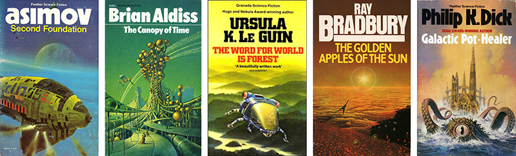
Original masters: covers by Chris Foss, Bruce Pennington, Peter Elson, Peter Goodfellow and Bruce Pennington again (I think).
Rearranging my book shelves the other day, I became happily distracted by the covers of my science fiction collection. I have always loved the genre’s cover art and from the age of about nine, it wholly succeeded in drawing me into the literature; as well as enchanting me in its own right. Quite often these images turned out to bear little or no relation to the narrative within and in fact drew me into entirely different worlds of the imagination, than those they were commissioned to sell. This will be the first in an ongoing series of posts about my favourite visual art form. Some of these posts will be about specific artists while others will be about the different aspects of this kind of work and my enjoyment of it.
I could make a long and spirited argument that one day science fiction will be seen as the most important kind of literature, of the 20th Century and maybe beyond. In short, while it is often wanting in style or finesse; it is – by its very nature – strong on narrative and strong on the big issues that face us, in the near and the not so near future. While the literati delight in the filigree of contemporary mainstream fiction, science fiction has long anticipated and wrestled with the moral issues and dilemmas that advances in science and the subsequent emerging technology bring. Mainstream literature is the “this is”: science fiction is the “what if?”
In my opinion, there is a similar tension between the contemporary art world and science fiction and fantasy art. Of course to a large extent this echoes the wider conversation between fine art and mass culture. Although both pop art and post-modern art were happy to consume and recycle the kind of pulp imagery typical of the science fiction and fantasy art of the 1950s and early 1960s, throughout the latter part of the 20th Century; the “art world” did not seem to engage with the genre’s more technically accomplished work from the later 1960s, 1970s and beyond. This changed more recently, amid some controversy.
For some time it would appear that the British art establishment has been addressing an audience of ever decreasing numbers but of ever increasing wealth. For the vast majority of people, what often passes as fine art is just as beyond our comprehension as it is beyond our pockets. Having moved on from concept art, where the concept was that there was no concept (yes, that was actually done), you might have thought that the fine art world have nowhere to go. You would be wrong.
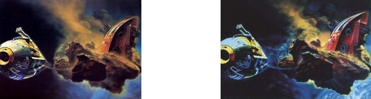
Left: “Nemo’s Castle”
by Chris Foss (the original) Right: “Ornamental Despair
(Painting for Ian Curtis)”
by Glenn Brown
.
Recently a painting, from 2002, called Ornamental Despair (Painting for Ian Curtis) by Glenn Brown was sold for £3,554,500. This was little more than a well-executed copy of Nemo’s Castle, painted by Chris Foss many years previously. These are Glenn Browns words, about this picture:
“Foss paintings never look like my versions of them. Mine are always played around with. The colors are altered, the cities were redrawn and I was always inventing things to increase their intensity right from the start. Even 16 years ago I was playing with the images to increase that sense of the Gothic. It was partially there in Chris Foss’s work, but not in quite the same way. All the while I was sort of learning what you can do, learning different techniques from other people. But I never want to lose that notion of appropriation—people say to me, sooner or later you’ll stop copying other artists and you’ll make work of your own, but it’s never been my point to try to do that, because I never thought you ever could. The work is always going to be based on something, and I wanted to make the relationship with art history as obvious as possible. Again, I think it increases the intensity of the way that people look at things.”
Maybe Glenn Brown would have been better to begin by saying “Foss paintings never look exactly like my versions of them”. Most viewers, I imagine, would find the differences between the two paintings very small indeed. That said, if he is claiming that the difference between the two – however narrow – is the space where his art exists; we should give some thought to the significance of that “played around with” aspect of the work. Glen Brown is also stating clearly that the idea of appropriation is central to his work, that he is not passing the painting off as entirely original. Indeed he has always acknowledged the authorship of the original painting and its relationship with his copy. I understand he also got some kind of permission to reference or “sample” the work. It must also be said that it was not Glenn Brown who made more than three an a half million pounds from the sale of Ornamental Despair but a subsequent owner. It is also known that Chris Foss received an undisclosed amount of money, in recognition of his joint authorship of the copy. More significantly – “I wanted to make the relationship with art history as obvious as possible” – Glenn Brown is acknowledging Nemo’s Castle by Chris Foss as part of art history.
Now would usually be the point to talk about post-modernism in some depth but I am not going to. Others have covered this very well, elsewhere: if you are interested please check out the links below. Here, I am going to take another angle.
In the Chinese art tradition an aspiring artist must spend years and years painstakingly reproducing the works of masters, before being allowed to introduce the first smallest stylistic elements of theirs own into the work. Only when one has become adept at copying and then making subtle variations, on existing and recognised themes, is one seen to have acquired the necessary gravitas to become an innovator. Therefore in one sense Glenn Brown’s work represents a transposition of this tradition; a tradition where Chris Foss would be a Master and he would be a novice – even if a talented one. Of course in this cultural paradigm, there is no sense of the copy being any kind of appropriation of the master’s work: it is a tribute. While one may well find virtue in Glenn Brown’s small variations, the vast part of the image’s virtues are those imparted by its original creator.
And there is the rub: these small variations and the very act of appropriation are imbued, by the art establishment and the fine art market, with a value that is grotesquely out of proportion to the value ascribed to the original work. This is something that is not only upsetting to Chris Foss and the other artists who had their work similarly copied by Glenn Brown but to all of us to love science fiction art. I know that post-modernists would say that I am missing the point but I simply do not care. In the fullness of time, I believe that their opinions will prove to be quite unimportant. It would be tempting to argue that this affair demonstrates that the art establishment has reached the end of a blind alley but somehow I suspect it will roll on to further absurdities.
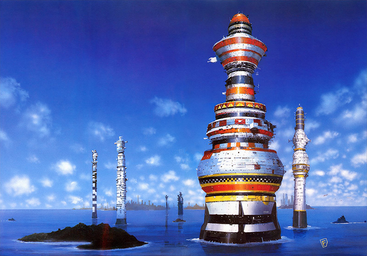
“Dayworld Rebel – LA Towers” – my favourite Chris Foss painting (prints available from the website chrisfossart.com – see below)
.
I would argue that in the long run Chris Foss is a more important artist than Glenn Brown. Quite apart from anything else, as illustrator of “The Joy of Sex”, Chris Foss contributed to one of the most culturally significant artefacts of the 1970s. However dated some of its attitudes might now seem to be, translated into more than 20 languages and selling more than 10m copies, this book had a substantial and lasting impact on society. He has also had a real influence on contemporary popular culture, both as a science fiction book cover artist and film set designer. I will go into this work in more detail another time. The point is that many, many more people will have encountered his book covers than will have come across Glenn Brown’s work. Not only that, I believe his work will prove to be more influential, in the long run. Science fiction, both books and film, is the genre most beloved by geeks; the very people who invent the artefacts that make up our contemporary, manufactured environment.
BTW – I love the music of Ian Curtis and Joy Division: I do not think naming a copied image for him is much of a tribute.
Apr 26, 2014
Gorgeous Vintage Children’s Book Covers From All Over the World
Some facts for you: everyone loves children’s books, and everyone loves vintage book covers, and everyone loves books from far-flung lands. So why not amuse yourself by looking at a collection of lovely children’s books from decades past and from authors both foreign and domestic?
After the jump, find a modest collection of particularly beautiful vintage children’s books — just 20 out of the hundreds that are out there — and for the good of everyone’s eyeballs, please add links to your own favorites in the comments.
A Little Princess, 1919 [Image via]
Russian children’s book Station ‘Moon’, 1963 [Image via]
The Water Babies, 1910 [Image via]
Korean children’s book The Village with a Zelkova Tree, 1966, illustrations by Yi Ju-hun [Image via]
A Child’s Book of Warriors, 1907 [Image via]
Estonian children’s book Kärp, 1981, illustrated by Ene Pikk [Image via]
The Book of Saints and Friendly Beasts, 1927 [Image via]
Polish children’s book Pan Twardowski [Image via]
Lithuanian children’s book The Liberator of the Sun, 1959 [Image via]
British edition of The Secret Garden [Image via]
Dutch children’s book Valeriane Goes to Sea [Image via]
Blast Off, 1973 [Image via]
Polish children’s book Ambaje, illustrated by Jan Marcin Szancer, 1967 [Image via]
Nathaniel Hawthorne’s The Wonder-Book for Girls and Boys, 1884 [Image via]
Czech children’s book Button Tales, illustrated by Eva Bednářová, 1974 [Image via]
Nursery Songs, UK [Image via]
French children’s book April’s Fish, 1936 [Image via]
The Merry Adventures of Robin Hood [Image via]
Korean children’s book A Child From a Mountain Village, 1965, cover by Baek Yeong-su [Image via]
Japanese children’s book [Image via]


Mar 16, 2014
Pentecost New Cover - Still Free on Amazon

A power kept secret for 2000 years. A woman who stands to lose everything.
India. When a nun is burned alive on the sacred ghats of Varanasi, and the stone she carried is stolen, an international hunt is triggered for the relics of the early church.
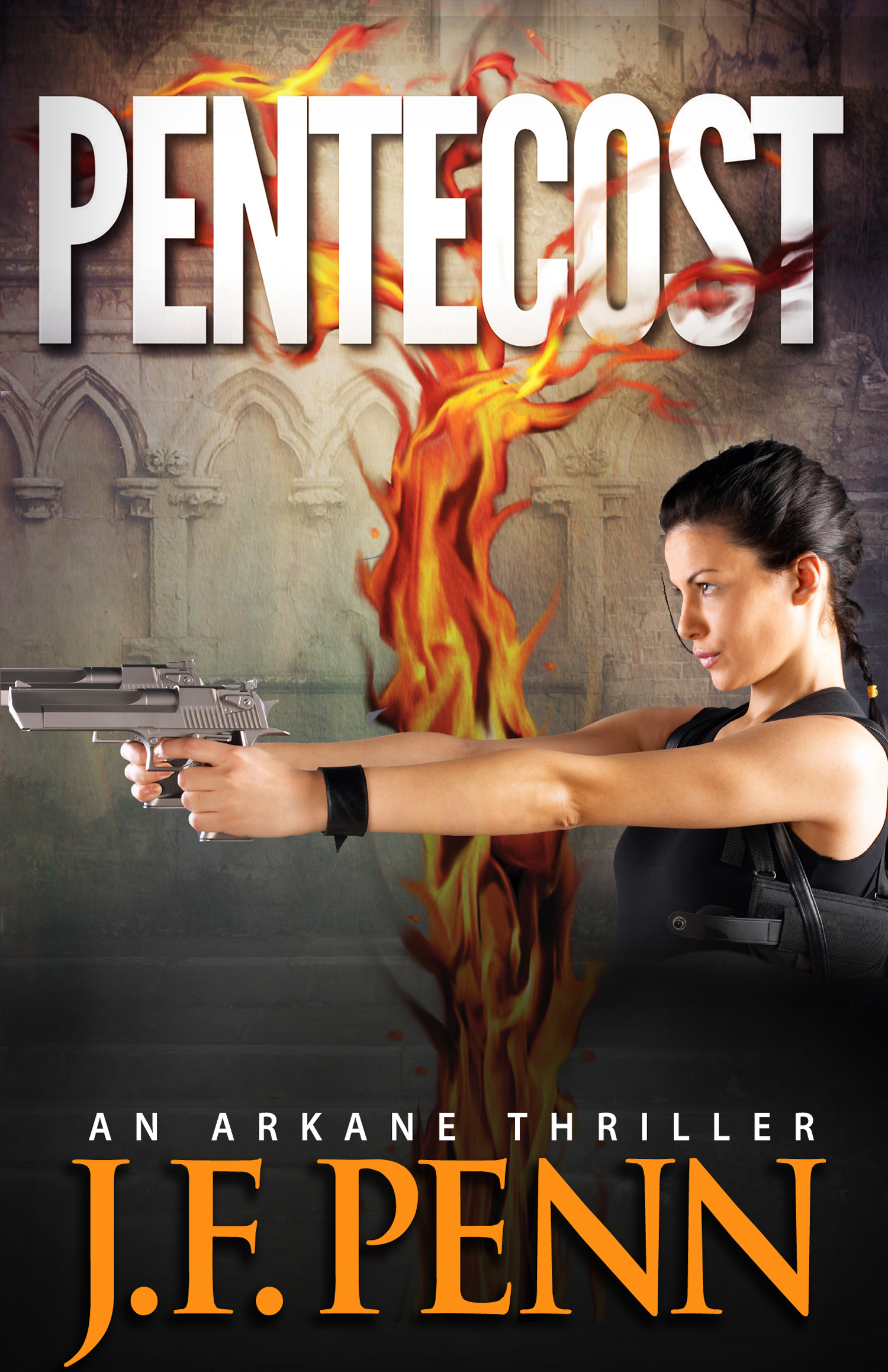
Forged in the fire and blood of martyrs, the Pentecost stones have been handed down through generations of Keepers who kept their power and locations secret.
Until now.
The Keepers are being murdered, the stones stolen by those who would use them for evil in a world transformed by religious fundamentalism.
Oxford University psychologist Morgan Sierra is forced into the search when her sister and niece are held hostage. She is helped by Jake Timber from the mysterious ARKANE, a British government agency specializing in paranormal and religious experience. Morgan must risk her own life to save her family, but will she ultimately be betrayed?
From ancient Christian sites in Spain, Italy and Israel to the far reaches of Iran and Tunisia, Morgan and Jake must track down the stones through the myths of the early church in a race against time before a new Pentecost is summoned, this time powered by the fires of evil.
The first in the ARKANE series, PENTECOST is a fast-paced thriller that explores the edges of faith against a backdrop of early Christian history, archaeology and psychology.
Buy Now:Amazon stores in Kindle, print and audiobook
Audiobook at Audible.com
Pentecost on Barnes & Noble in print
Pentecost on Kobo
Pentecost on iBookstore
Pentecost on Goodreads (for reviews)
Book Trailer
Reviews
Pentecost is Rated 4 **** Bestseller in Action-Adventure and Religious Fiction with 140+ reviews
- “If you enjoy a fast-paced thriller that brings an intriguing mix of history and fiction, then Pentecost by Joanna Penn should be on your list of “must reads”. Review by CG Lawrence
- “This book has elements that will appeal to all thriller fans – there’s a bit of Indiana Jones, a bit of Wilbur Smith, a bit of Dan Brown and a lot of Joanna Penn and I have no hesitation in recommending it. It’s a rollicking good read..” Review by Alan Baxter
- “Penn has a gift for describing the various cathedrals, basilicas, and lands that Morgan and Jake journey to, making the setting vibrant and alive throughout the book. Penn is also a master at weaving in religious information throughout the story that push the plot along. The pacing of the story is unparalleled …” Review by Melanie Hawthorne
- “The most awesome book I have read in a long time. A page turner from the beginning to the end. Even the authors note is interesting.” Review by Sharon Flood
- “I happen to love books with religious themes. I couldn’t put down Dan Brown’s books. I couldn’t put this book down either. A strong woman, a lot of action, and unfamiliar religious history hooked me. I knew nothing about the religious background behind this story and I found it very interesting. If you love action, and esoteric religious history, you will really like this book.” Review by Janis Friesler
- “Joanna Penn hooked me immediately with her understanding of church history, and geography and historical documentation. PENTECOST is more than a fictional pleasure read; it is the stuff that movie producers drool over, keeping them up at night wondering why they hadn’t thought of such an intriguing premise.” Review by Jeff Bennington
- “Mix history, fast-action and fiction together and you get Joanna Penn’s debut novel, Pentecost. Each page prompts you to turn to the next one, making it difficult for you to put this book down. This thriller is set in the Christian history that most are familiar with, but takes a new look at it through the author’s creative and intriguing fiction that is woven throughout the story.” Review by Tony Eldridge
- “Intriguing, Dramatic, Suspenseful…these are the first words that come to mind when recalling Joanna’s Pentecost. This book has been compared to Dan Brown and Indiana Jones. However, as I read it I was reminded of two of my favorite authors, Sidney Sheldon and Dean Koontz, despite the different genres they all write in.” Review by Cynthia Tucker
- “If you like Indiana Jones action, a Lora Croft style heroine and a mystery steeped in Christian myth and mysticism, then Pentecost is the book for you.Full of fast-paced action this book hits the ground running from the beginning.” Review by Virginia Ripple
More Reviews
- Review of Pentecost by Seeley James “Joanna Penn achieves what Steve Berry dreams of, a thriller that takes the reader deep into remote locations, ancient myths, and local histories with a passionate, compelling voice. Where Steve Berry’s passages read like a travelogue, Ms. Penn flows like the informed adventure with an enthusiastic guide. No doubt this is due to her Masters in Theology and her love of psychology. ”
- Review by Stephanie Fishman “Pentecost is a visually descriptive thriller that brings not only characters to life but locations and history as they are seamlessly woven into the storyline … some of the locations are not only real but have been visited by the author. It definitely shines through in her writing. She has a talent for sharing what the surroundings look like, describing even the tiniest detail of the books on a shelf in a college office or the look and feel of a religious icon. She must have an eye for visual art because she was able to clearly and creatively share the nuances of several pieces brilliantly in written form.”
- Review by Pen and Muse, Kristen Jett. “If a female Indiana Jones met THE DA VINCI CODE, you’d get PENTECOST.”
Research for Pentecost
Book Marketing: On Changing Book Covers
One of the main reasons for self-publishing is creative freedom and control.
Many of us regularly update book blurb/descriptions, as well as changing categories and keywords. I’ve also blogged before about making sure non-fiction book titles are based on keyword research.
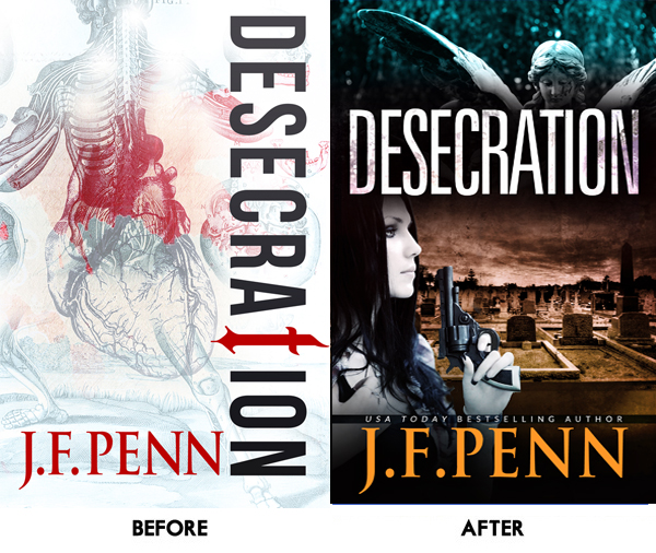
Today I’m talking about changing book covers because within a few hours, you can completely change the look and emotional impact of your book. When authors like Polly Courtney have resigned over the cover branding for their books, this seems like the ultimate indie freedom.

I published Desecration, a crime thriller, in Nov 2013, and after it debuted on the bestseller list alongside Michael Connelly, it pretty much sank down the charts. I haven’t done any further promotion, and it hasn’t sold as well as my other books.
It gets brilliant reviews, so once people read it, they love it. But not enough people were trying it … sure, I haven’t done any specific promotion, but based on my other book sales, it should be doing better.The ‘aha’ moment
Russell Blake, the author who has sold over 400,000 thrillers and now writes with Clive Cussler, wrote a post in Feb 2014 about tweaking his covers. Russell changes covers in order to “find one that resonates with my readership – as expressed in increased sales.”
He changed the cover on one specific book, Fatal Exchange, four times before settling on the latest iteration – which moved from a theme based to a person based cover.

HM Ward is probably the most successful indie author right now, with over 4 million books sold and 11 NY Times bestsellers in 2013. She wrote this post about changing her book covers – from arty to genre obvious – and says that:These two fantastic indie authors provided me with an ‘aha’ moment, and this is what I decided.“COVERS ARE STOP SIGNS. They should quickly reveal as much info about your book to the reader as possible and this did not. As soon as I changed the covers to the current version, sales shot up … Short version: I was really stupid. Don’t wait 9 months to change covers or descriptions on books that aren’t preforming.”
My mistake #1: Theme over character
I always have a strong theme in my books, and for Desecration the main theme is anatomy and whether the physical body actually defines who we really are. Yes, this is a deep and meaningful topic and I explore the use of the physical body in life through tattoos, body modification and alternative nightclub Torture Garden. I also write about the use of the body after death in medical specimens and corpse art.
But mainly it’s a murder mystery with a British detective, Jamie Brooke, whose daughter is dying. Jamie will do anything to protect her daughter in life … and in death.

In the initial brief to my [wonderful] designer, Derek Murphy of Creativindie, I had only given him the themes. I didn’t even mention the characters. So the first cover, through all initial iterations, was about the medical specimens and anatomy. It’s gorgeous, but it has no emotional resonance through character.
For the second cover, the brief was: grieving mother who will do anything to avenge the wrong done to her daughter, and to bring justice to the murder victim. It was all about character.My mistake #2: Not meeting genre expectations
Desecration is a crime thriller, with an edge of horror in parts. It’s certainly not for the squeamish. It has a dark tone and a dark theme. The white cover has therefore confused readers of this type of book. White just isn’t very dark
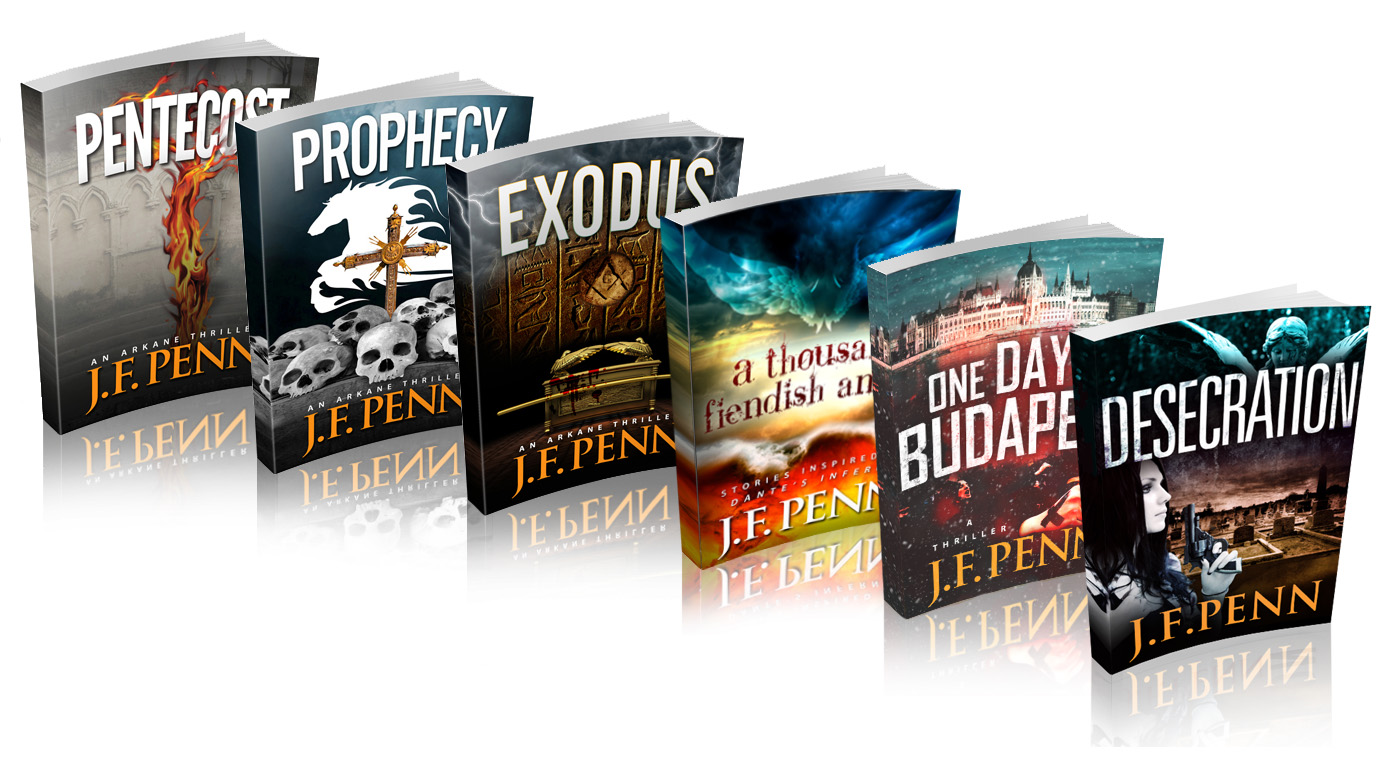
 People have also said the original cover looks very arty, very literary fiction. The font down the side is beautiful but not easily readable and the word ‘Desecration’ is difficult for some anyway. It’s the HM Ward mistake – falling in love with the art, and not thinking of the reader expectation first.The white cover also didn’t really fit with my other J.F.Penn books which are all dark. The new image of all my books together looks a lot better with another dark book in the frame, as above right.
Comments from Derek Murphy, my cover designer
I asked Derek for a quote for this article, since he did both rounds. Here’s what he said.
“We tried a lot of ideas with the first round for Desecration, using mostly symbolic elements. Joanna previously had been adverse to using people on covers so we kept things simple; the final cover she chose is interesting and unique – but wasn’t selling well. Here are some reasons why:
1. No emotional connection. Emotion is mostly a matter of scene, color and contrast, although adding characters can help a lot as well.2. People usually sell covers. Even if a little cliche or overused, stock photo models seem to increase sales.3. No genre identification. Symbolic covers are better for non-fiction. The stern white, while clinically suitable, probably seemed too much like a non-fiction book. At the very least it was unclear what the book was about – this could have been improved with a tagline.4. No depth. Adding a scene lets readers know more about the setting and feels more like they can ‘walk into’ the story. It’s tough to pull off a flat, symbolic cover (even though major bestsellers seem to use them, like the Game or Thrones series, Twilight, Shades of Gray, etc.)
The new cover fixes most of these issues. It’s not a matter of what “looks better” or what people will like – the cover’s job is to let readers know what the book is about and whether they might be interested in a single, 1 second glance. If the cover isn’t doing this, there’s a good chance they aren’t going to take a closer look or read the summary or reviews.”
You can find Derek at Creativindie Book Covers, and he also has this great post about DIY Covers in MS Word, as well as a fantastic program to help authors with book cover design. You can find more cover designers here.
The new cover
I am really happy with the new cover!
I spent over 5 hours trawling through all the image sites looking for my idea of Jamie Brooke, the main character. This model totally fits the bill. Of course, British police detectives don’t carry guns, but I decided a little artistic license would suit the American audience more
I’ve also just uploaded the new print covers to Createspace, so if you have one of the older cover print books, it is officially a limited edition!
In terms of results, it’s difficult to say yet. The ranking on the Amazon.com store has moved from ~200,000 to ~50,000, but I have also been involved in other promotions this month. It will be best to wait a few months and see how the average sales are over time.Tweaking my other covers
Since my other book covers have also been theme-driven, and I had a BookBub promo coming up a few weeks ago, we decided to change Pentecost as well to add a female character. We didn’t want to change the rest of the cover in an attempt to see whether the addition of a woman would make a difference.
I also searched hard for this model, who fits incredibly well since my Dr Morgan Sierra is closely modeled on Lara Croft!
Although it’s hard to do any kind of split testing when you only have one book, I have now had two free runs on BookBub for Pentecost.
The first run resulted in ~20,000 free downloads. This latest run with the new cover resulted in over 30,000 downloads. I can’t directly attribute it to the addition of the female figure, but at least it shows that the cover change wasn’t detrimental, and could mean it was a positive move.
OK, I would love to hear what you think. Firstly, what do you think of my cover change? Do you think the new covers are more effective? Also, have you changed your own covers and has this impacted sales? Please leave a comment below.
http://www.thecreativepenn.com/2014/03/11/changing-book-covers/comment-page-2/#comment-88268
Feb 6, 2014
8 Hilariously Misleading Covers Slapped on Classic Books

The whole "don't judge a book by its cover" thing came about for good reason: The people who design book covers often don't even read the books. Who has the time? Now, you wouldn't think this would be a problem when designing the cover for a classic everyone is familiar with -- you don't have to know how to read to know what, say, The Wizard of Oz or 1984 is about.
So when those classic books fall into the hands of the rare cover artist who somehow has no idea what's going on, that's when hilarity ensues ...
#8. Fantastic Tales by Edgar Allan Poe
Poe's fiction contains such timelessly iconic images as mouthy ravens and swinging pendulums, and delves into such truly archetypal fears as being buried alive and being bludgeoned to death with a candelabrum by soft-core '70s porn. What, you don't remember that last one in any Poe story you've ever read? Yeah, neither do we.A rare and radiant maiden whom the angels name Lenore.

Maybe it's just us, but "scantily clad female" comes in just behind "monster trucks" in the list of images that the collected work of Edgar Allan Poe brings to mind. But maybe we're missing the point -- perhaps if you look close enough at this image that appears to be torn straight from the cover of that VHS tape your dad used to hide in the bottom of his sock drawer, there's some untold horror lurking inside.
Lo! There it is:
Hiding right there in plain sight. Staring you right in the face, as it were. Endlessly watching. Endlessly knowing.
#7. 1984 by George Orwell
In the dystopian future-past of 1984, the Anti-Sex League is a radical organization pushing an agenda of outright celibacy. But what about propagation of the species, you ask? Only by way of artificial insemination, bucky -- if they have their way, your little swimmers will only get to play in the pool by way of a third party driving them there. So of course the obvious way for a member of the league to portray those ideals, at least according to this cover, is by wearing a standard uniform consisting of a boobtastically low-cut dress with an "ANTI-SEX LEAGUE" button drawing everyone's attention straight to her generous cleavage."Freedom Is Slavery" repurposed as a BDSM tagline.via Crisol Plural

And if you, as a male member of this fictional society, choose not to look? Well, there's no danger of that happening -- not when Big Brother has deployed his army of be-gimp-suited goons to stand by with scowls cocked and ready to ensure that you damn well look at that cleavage.
We're not exactly sure what the word is for what's going on in this scene, but we're pretty sure "dystopia" ain't it.
#6. Dorothy and the Wizard in Oz by L. Frank Baum
The Oz books are practically bursting at the seams with instantly recognizable imagery, but why design a cover around yellow brick roads or emerald cities or witches or tin men when you could slap some fucking space jets on there instead? If this version of the story doesn't feature the Cowardly Lion discovering his courage by way of rechristening himself "Maverick" and doling out some sky-murder to a squadron of Venusian MiGs, we're going to be sorely disappointed.Munchkins in Space, Episode 4 of the Oz saga.via Hongkiat
This cover is just one example from the apparently lucrative industry of taking an out-of-copyright classic, slapping together a print-on-demand edition of said classic, and fooling middle schoolers into buying it. And we have to admit that maybe they're on to something, because the Vexin Classics series of classic novels -- from The Adventures of Huckleberry Finn to Frankenstein -- featuring completely irrelevant naked ladies on their covers would certainly have caught our adolescent eyeballs.
#5. The Lost World by Sir Arthur Conan Doyle
Hey, plastic comes from oil, and they say oil comes from dinosaurs.via Bookonaut

And so, the bold Edwardian explorers have stumbled across the fabled Lost World, a land in which the flora and fauna have remained unchanged since time immemorial -- largely because they're made entirely out of plastic, and we all know that shit don't biodegrade.
Presumably this is what happens when the person in charge of cover designs hands the reins over to his 6-year-old son and his best friend, who is also a stuffed tiger. And actually, if you look at it that way -- as the Calvin-and-Hobbesian approach to publishing classic literature -- it's not so bad. Keep on rocking those plastic dinosaurs, you li'l Ray Harryhausen, you.
Be sure to hit up the Dispensary for our T-shirts that have been scientifically proven to make you a more awesome reader.
Feb 3, 2014
Interview with Julie Dillonwith Julie Dillon
Interview with Julie Dillon
Posted on: February 3, 2014
Ok blog tour participants and anyone else who has a copy of The Book of Apex Vol 4, raise your hand if you have a print copy. it looks wet, doesn’t it? I left the book on the kitchen table a few times, and even my husband wondered why I’d let water get on a book. The magical cover of this book, my friends, is the work of the unbelievably talented Julie Dillon.
(in fact, all of the artwork you see in this post is by Julie Dillon)
That names rings a bell, doesn’t it? Oh yeah, she also did the cover art of the very first Subterranean Press special edition I bought for myself, Silently And Very Fast, by Catherynne M. Valente.
So it goes without saying that I was over the moon when Julie agreed to do an interview for this blog tour. When you’re just browsing through the bookstore, not looking for anything in particular, what do you gravitate towards? Interesting cover art, of course. Julie Dillon makes that cover art. She’s the reason you touch a book. She’s the reason I expected my finger to come away wet every time I picked up The Book of Apex: Volume 4 of Apex Magazine.
So let’s get to the interview!
LRR: You’ve won the Chelsea award twice, been nominated for the World Fantasy award and you were nominated for a Hugo Award for Best Professional Artist in 2013. What was it like to learn you had made the Hugo ballot? And speaking of, we’re right in the middle of nomination season. Are you eligible again this year?
J.D.: It was very validating to make the Hugo ballot. I didn’t think I’d be ready for that kind of recognition for another 5 years or so, and I was blown away that I was nominated. I was very honored and flattered that people saw anything of value in what I do. That said, I try not to let awards or nominations affect me too much, and I try to keep learning and working hard regardless of whether or not I am recognized. The recognition definitely helps, though, and goes a long way for helping me to reaffirm my decision to purse art fulltime. Getting awards and nominations encourages me to keep trying even harder.
I do have several pieces that are eligible for the Hugos this year. Andrea Höst was kind enough to put together a tumblr of various artists’ eligible work. My posts are available here and here.
LRR: Did you always want to be an artist? Can you tell us a little about your journey to becoming a professional artist?Cover for Long Hidden Anthology
J.D.: That’s a tricky question. I was always interested in drawing and creating, but it never really occurred to me that I could pursue art as my profession until my mid twenties. From all I had heard from other people, art was just something you do as a hobby in between your real work and real jobs. I spent much of my college life prepping for other careers, but I was always drawing and painting whenever I had free time. Eventually, thanks to the internet, I started noticing that there were such things as art schools, and professional artists, and people making a living doing a variety of types of art. I started wondering if maybe that was something I could do, too, and slowly I began taking actual art classes and investigating local art schools, and eventually started seeking out more freelance jobs. It took many long years before I got my portfolio up to a level where I was able to have fulltime freelance work, and I probably would have progressed faster if I had believed in myself more earlier on, but all things considered I think I’m doing an okay job of it.
LRR: What are your thoughts on traditional media (oil, acrylic, etc) vs digital?“Breaking Through”
J.D.: I think traditional media is vitally important, I think there are a lot of benefits to working in traditional media, and I enjoy doing working with real paint when I get the chance. But I think digital media is a valid tool, one that has it’s own strengths and weaknesses. So often I see people dismissing digital art as somehow cheating or not as valid or important as traditional art, but the computer is just another tool. It doesn’t do the work for you, you still need to have foundational drawing and painting skills to make a good digital piece. I personally prefer working digitally because it allows me to work quickly and cleanly. I don’t have to buy paint or brushes or canvases, I don’t have to wait for paintings to dry before sending them to clients, I don’t have to photograph or scan my final work, and I can make edits immediately and easily. But, I also do not have a physical original painting that I can hang up or sell, and I do miss out on the fun and satisfaction of working with real paint.
LRR: How long, on average, does it take you to complete a piece of art?“Launch Point”
J.D.: It’s hard to tell, since I’m usually working on multiple illustrations that I rotate through, but I’ll usually spend at lease several days or weeks working on something. The actual time spent on any given piece are probably something like 8-20 hours, depending on the complexity.
LRR: Do you do commissioned pieces as well? How does that creative process differ from when you are creating a piece out of your mind?
J.D.: Most of my work is commissioned, although I don’t post all of it online. The main difference between commissioned work and work I do for myself is that if I’m doing for myself, I don’t have to worry about sticking to an art description or working for a specific audience or project. On the one hand, with commissioned work it’s sometimes nice having an art director to bounce ideas off of, because sometimes it’s difficult narrowing down concepts or compositions. But it’s also nice to be answerable only to myself and to work on projects where I have full control over how the piece progresses.
LRR: I really enjoyed the Digital Illustration Tutorial you have on your website, it really opened my eyes to all of the behind the scenes work that goes into art creation. do you think you’d do more tutorials like this?“Ancient Discovery”
J.D.: Thank you! I’m glad it made at least a little sense; I worry if I’m being coherent or helpful at all when I make those things. I might do more tutorials in the future, although I’m not sure what my focus would be. For the most part, my actual method of painting has remained the same. Any improvements I’ve been making have been because I’ve been going back and trying to work on my art foundation skills more with figure drawing and anatomy studies.
Want more of Julie’s artwork? Of course you do! Check out her website, and her deviant art site.“Nautili”
![Pageflex Persona [document: PRS0000040_00012]](http://littleredreviewer.files.wordpress.com/2014/01/book-of-apex-v4.jpg)


Subscribe to:
Posts
(
Atom
)